
COLOR MANAGEMENT
Colour management is the process of balancing your monitor to achieve colour consistency between your display and final print output. The end goal is to have images displayed on your screen more closely match the final printed product.
Follow the guidelines below to achieve more consistent results across your screen and final print output.
1. Monitor Calibration
-
Why do you need to calibrate your monitor?
- How to calibrate your monitor?
-
Additional links to guidelines how to use monitor calibration kits
2. File Format and Colour Profile
3. Bleed and Crop marks
4. Order Test Prints
5. Soft Proofing
-
Adobe Lightroom
-
Adobe Photoshop
1.Monitor calibration.
- Why do you need to calibrate your monitor?
If you’ve ever printed and been dissatisfied with the print, it could be that your screen is fooling you when you’re editing. Not all monitors display colours the same. Some panels are “warmer” (more yellow) or “cooler” (bluer). Often the most prominent issue seen in un-calibrated screens is the brightness being set too high under default factory settings, meaning that the final print output appears to be significantly darker in comparison. One of the primary goals of a calibration device is to set a more appropriate screen brightness.

In the image you can see a warm white colour and a cool white colour. If everything was tinged either of these colours, your eyes would interpret it as white.

This is where color calibration comes in. By calibrating the white values of your display—and other things like brightness and saturation—to the proper neutral values, you will see your images correctly.
- How to calibrate your monitor?
The first step towards achieving colour consistency between your screen and final prints is using a monitor calibration device to calibrate your screen.

Calibration devices attach to the front of your monitor and analyse a series of colours and grey levels displayed on your screen via the device’s software. This is called a spectrophotometer. It’s just a name for what it does: photo = light, spectro = from spectrum meaning a range of colors, and meter = to measure. So, it measures the light color.
Some examples of the screen calibration kits include the X-Rite i1 Display Pro, the Spyder Pro, and the Color Munki. but there are numerous options available. The process for each is similar and pretty straightforward. First you install the software, and run it. Next you attach the device. Initially you have to decide the settings, but the correct ones are usually suggested. Usually these are 120cd/m2 or less in brightness, D65 or Native for Illuminate and 2.2 for Gamma. At the start you may need to set the monitor brightness and contrast via the monitor’s own menu. Finally, you just let the software run and it will create a profile automatically at the end. One thing that’s critical is that you need to have your monitor on for a while before starting the calibration. It takes up to 30 minutes for the monitor to settle.
- Additional links to guidelines how to use monitor calibration kits
- https://digital-photography-school.com/why-is-monitor-calibration-important-and-how-to-do-it/
- http://www.francescogola.net/tutorial/monitor-calibration-and-profiling-with-x-rite-i1display-pro-and-iprofiler/
- https://www.damiensymonds.net/cal_S4P_pc.html
- https://www.damiensymonds.net/cal_CMD_pc.html
- File format and Colour profile
It is essential to ensure your images are in the appropriate format before placing and order with us. We do accept the file formats JPG, TIF, PDF and PSD.
Uploaded files should ideally be 300 DPI, 8-bit or 16-bit, and have an embedded either the sRGB, Adobe RGB or ProPhoto RGB colour profile.
We would recommend creating and saving an Export Preset using the following settings for future print use (follow the guidelines below).
- ADOBE LIGHTROOM - Recommended Export Settings:

- ADOBE PHOTOSHOP - Recommend to create document using the following settings for future print use.:

- ADOBE PHOTOSHOP: recommend the following colour settings (Edit > Colour Settings.)

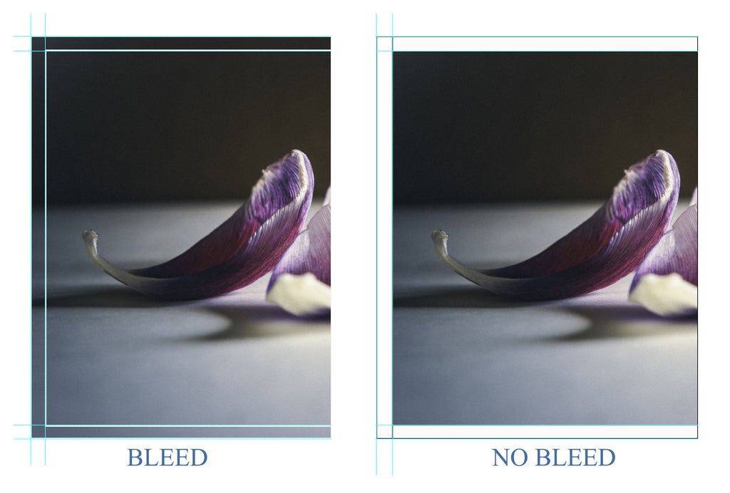
- BLEED & CROP MARKS
Setting your print files up with bleed is required to run your artwork to the edge of a page.
Your art/image is printed on a sheet of paper with a border, then trimmed down to your required paper size. If you don’t allow for a bleed, your artwork might end up not running to edge of the page and have a white gap. Include crop marks when you save you file, this will show where your bleed is and where we should trim the file.

Ideally, adding 3mm -5mm bleed to your artwork will ensure you get the best results for your final print. (see an example).
- Order Test Prints
An essential part of the overall colour management process at this stage is how near/far your monitor is to our print outputs, and to help with this we offer a test print service.
For best results, submit a TEST PRINT ORDER containing a range of images which cover a wide spectrum, a so-called printer evaluation chart. It will help with any density of colours adjustments you may need to make and detect problems ahead of time by including highly saturated, hard to render colors, various skin tones, gray ramps, smooth color gradations and tonal transitions.
For our evaluation contact us on our email address info@picturebloc.com.
IMPORTANT!
When ordering prints Picture Bloc only adjusts your image file if you want us to.
Our experienced and knowledgeable staff can optimize your images (sharpening, cropping, leveling, toning, exposure, brightness/contrast, vibrancy/saturation, …) using their best judgement. Please let us know if you have any specific requests and we will do our best to full fill this.
When you chose option “IMAGE OPTIMIZATION.” we will run an automatic optimization tailored to your particular image.
Note: We recommend activating this option if you have not already made your own adjustments for printing or exposure.
Image optimization service charge is per hour.
- Soft proofing
When you receive your test prints the next step is to compare the print results with what you see on your screen. At this stage there’s a good chance that, although your prints will be a much closer match than pre-calibration results, they won’t exactly match the same images on your monitor just yet.
The key differences between screen and print is nature of their mediums:
- Monitors have their own light source and emit light whereas prints are reflective
- Viewing conditions in conjunction with above: natural daylight has very different light temperature from most artificial light sources and differences here can affect the overall look of your print
- Paper colour/whiteness of the paper used can vary from print process to print process
- Gamut of print process – the ability of the print process used to represent different colours
To help overcome this, programs such as Photoshop and Lightroom use a process called soft proofing, which use print profiles to match the screen to the paper type.
Soft Proofing is a form of calibration represented either on screen or most typically for a print.
It assists in ensuring that what you see on screen will match what is printed, and that means getting what’s on screen to play nicely within the gamut of the printing/destination color space.
Our soft-proofing profiles are designed to simulate the effects of the different types of print process and they are available for download.
|
Picture Bloc print product |
ICC Print Profile |
|
Hahnemühle FineArt Pearl (285g/m²) Canon FineArt Pearl (285g/m²) |
ICC profile Hahnemühle FineArt Pearl ICC profile Canon FineArt Pearl |
|
Hahnemühle Photo-Rag (308g/m²), matt Canon Photo-Rag (308g/m²), matt |
ICC Profile Hahnemühle Fine Art Matt ICC profile Canon FineArt Matt |
|
Hahnemühle FineArt Baryta (325g/m²), matt Canon FineArt Baryta (325g/m²), matt |
ICC Profile FineArt Baryta |
|
|
|
|
|
|
|
|
|
|
|
|
Soft Proofing in ADOBE LIGHTROOM: guidelines
Lightroom cannot use CMYK profiles or colour spaces


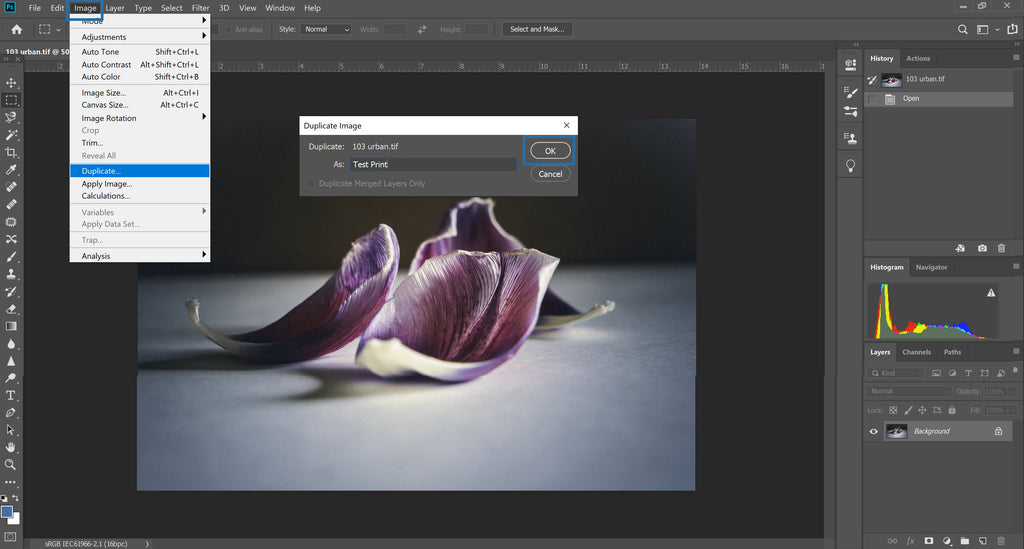
- Soft proofing In ADOBE PHOTOSHOP
It's important that the profile is used for proofing only and not saved to your files.
A good technique to Soft Proof within Photoshop, is to take your chosen finalized image and duplicate it. This allows you to keep your original file intact, and you can compare side by side your duplicated image close to the original.

Now comparing your images side by side, you should be able to observe any differences on your soft proof image. You can then make small changes to Levels and Curves, to bring your image as close as possible to the original, before saving for print.


